Middle America Project
Ranking America's Most Typical Counties
We often see rankings about places the stand out the most: from the wealthiest counties to the most distressed communities. Beltway reporters ventured out to talk to voters in counties that voted solidly for Donald Trump in an effort to understand what they missed in 2016. Books like Charles Murray’s “Coming Apart” vividly tells the story of the archetypical Belmont and Fishtown. We’re fascinated by places that exemplify America’s cultural divide.
We were interested in studying places that are the opposite of that — the communities that come closest to typifying America in every way — politically, economically, generationally, and in their racial, religious, and educational makeup. Which one county in the United States is America in microcosm? To answer this question, we developed the MAP — short for Middle America Project — that ranks every county in the U.S. on how representative it is of the country as a whole.
The typical American community isn’t a small town that voted for Donald Trump to counterbalance Hillary Clinton’s lopsided margin in the cities. By definition, it’s something in between. This usually means that it’s a small city with surrounding suburbs, mainly located in the Northeast and Midwest, that not only was closely contested in 2016 but closely resembles the social and demographic characteristics of the country as a whole.
America’s Median County: Dauphin County, Pennsylvania

Dauphin County also forms part of a region spanning from Cumberland County to its west through other central Pennsylvania like Lancaster and Berks, ending in Monroe County in Northeastern Pennsylvania with a high Middle America Score, a composite index that measures how closely a county reflects national trends. Lehigh County, Pennsylvania, home of Allentown, is the second most typical county in America falling just 9 points short of Dauphin in its Middle America Score (2,772 vs. 2,781). These rankings reflect the changing political landscape in Pennsylvania, in many ways 2020’s pivotal swing state. Where the Philadelphia suburbs were once the battleground obsessed over by campaigns and the press, their growing Democratic lean has shifted the state’s midpoint out to the mix of exurbs and small cities outside the state’s two population centers.
The Middle America Top 25

Other counties topping the Middle America Project rankings are are in the Midwest, including Scott County (Davenport), Iowa and Shawnee County (Topeka), Kansas. The adage “Will it play in Peoria?” turns out to be quite apt: Peoria County, Illinois is the fifth most typical county in the United States.
Mapping Every County
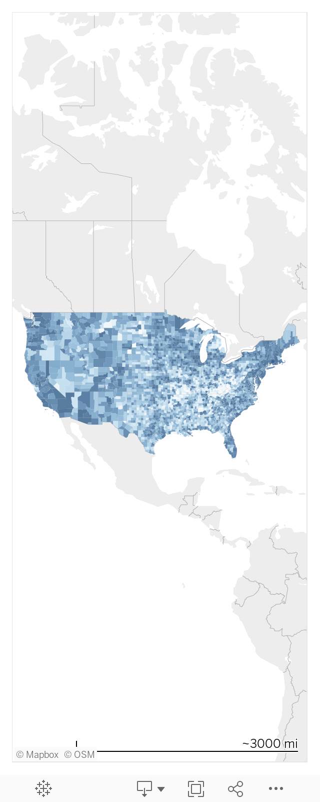
“Middle America” doesn’t just mean the Midwest: Suburbs and small cities throughout the Northeast, especially in New York and Connecticut, have demographic, educational, and political profiles that closely match the country as a whole. Major population centers tend to score lower, but we see a wide range in scores among major cities, with Washington, D.C. and its immediate suburbs scoring very low, New York City scoring fairly low, Los Angeles and Chicago scoring somewhere in the middle, and Maricopa County (Phoenix), Arizona scoring as the major metropolitan county most representative of the U.S. as a whole.
Outlying suburbs of major cities tend to more closely reflect the same overall mix as the country; this is true everywhere and particularly true in the Midwest. A cluster of counties ringing Lake Michigan, from Grand Rapids to the collar counties of Chicago, up through Wisconsin are statistically more reflective of the country. Coastal counties in Florida and South Carolina which have seen an influx of new residents also rank highly, along with large parts of the West Coast.
Places that are a very atypical include the rural “coal country” counties of West Virginia and Kentucky where Donald Trump received overwhelming support and have been the subject of countless profiles aiming to correct for blue state bias. They are atypical for the opposite reason that Washington, D.C. is atypical — they are almost an exact mirror image of the prosperous cities on the coasts in their voting behavior, wealth, and demographics.
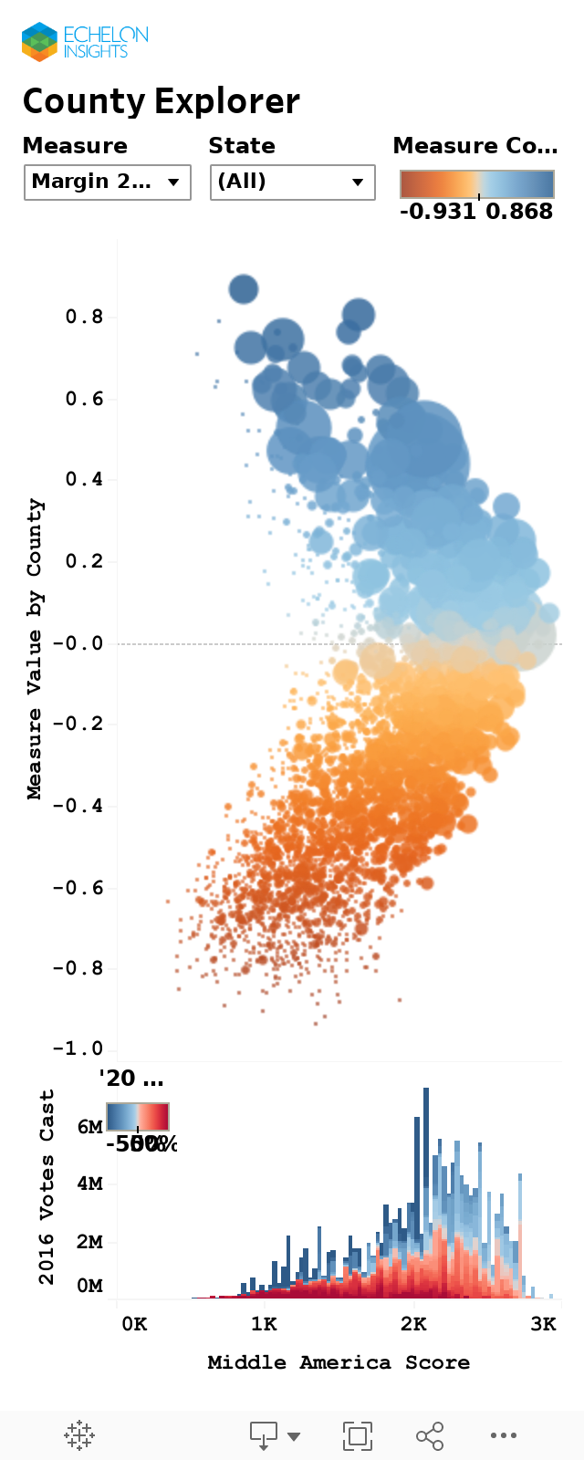
The Boomerang Pattern Formed by America’s Most Typical Counties
Because our Middle America Score tries to measure the most statistically average counties in America, plotting our scores against its various components yields a boomerang with the two “wings” of above-average and below-average counties spreading out from our high-ranking counties. The Middle America Score consists of more than a dozen measures, with some weighted more highly, specifically the 2016 election results and college graduation rate (which often tend to be a proxy for income, population density, and diversity). You can explore each county and how the various counties in our index interact with the Middle America Score below. The more significant the factor, the more the interactive below resembles a boomerang.
A Note About the Washington, D.C. and New York City Metro Areas
Because so much media and political power is concentrated in D.C. and New York, how do these cities and their surrounding regions fare in the Middle America Project?
Washington, D.C. and its close-in suburbs are among the least representative areas of the U.S. as a whole. Washington itself scores in the bottom of 0.9 percent of the U.S. population, and nearby Arlington, Virginia only outranks counties with 1.1 percent of the U.S. population. What primarily drives this divergence are high incomes and high rates of college education. But not too far away are counties that much more closely reflect the overall makeup of the U.S., including Baltimore County, Maryland (more typical than 84.4 percent of the U.S., Anne Arundel County, Maryland (71.1 percent) and Frederick County, Maryland (68.8 percent). Venturing out further to the Richmond, Virginia suburbs or the Eastern Shore of Maryland yields counties that score among the highest in the country.
New York City is also itself atypical, but not as atypical as Washington. Manhattan is more typical than 2.5 percent of America. The most typical borough is Staten Island (more typical than 73.9 percent of the country), followed by Queens (56.4 percent). Counties that are exceptionally representative of the rest of the country are not a far drive away, and these include New Haven County, Connecticut (96.8%) and Orange County, New York (89.2%).
Why This Matters
Reporters, feature writers, and demographers will continue to study out archetypes and places that stand out. Because so many of them live and work in highly educated metropolitan areas that are not representative of America as a whole, there is a natural curiosity in trying to understand something that’s the opposite of their day-to-day existence. But there is also value in immersing oneself in places that have it all, mixing red and blue in close proximity. We’ve often seen election year stories about electoral “bellwethers” – the counties that consistently pick the winners in Presidential politics – but over the years, stale heuristics have grown up accompanying battleground state coverage and they failed to account for the titanic shift in political geography we saw in 2016. Many old bellwethers, like the suburbs of major cities, are no longer close because their social and demographic makeup has diverged dramatically from the country as a whole. The Middle America Project is our attempt to update these assumptions for a new era. When it comes to finding 2020’s swing voters or test markets for new products, the Middle America Project shows you the map.

Sources: U.S. Census American Community Survey 5-Year Estimates and 2010 Decennial Census; Election Results from Dave Leip’s Atlas of U.S. Presidential Elections; U.S. Religion Census. County-level analysis excludes Alaska which does not report election results by county-level units.
The Intersection
Get the best stories in polling, data, and technology delivered to you weekly
Model, Segment, and Target Your Audience
Define the right target for powerful and effective persuasion. We model 180 million+ voters, 260 million+ consumers, and membership or targeting lists along any data point imaginable. From these individual-level models, we build smart target universes that serve as the foundation of data-driven and efficient voter or consumer outreach.

Target Resources Geographically
Backed by robust, high-sample size survey data, our models can give precise estimates of support for the country at large or in specific geographies or granular segments impossible to measure through traditional surveys. Allocate resources across turfs efficiently and in real time through live, command-center dashboards available right at your fingertips.

Data Visualization
Data doesn’t work if it’s not readily accessed or understood. Humans are visual learners. We relate to data most often through the right visualization instead of spreadsheets or complex algorithms. Our interactive dashboards relentlessly clarify, inform, and simplify, giving you the visual insight you need to take action.
